Over 70% of online shopping carts are abandoned before customers finalize their purchases, making a significant challenge for e-commerce businesses. However, abandonment cart emails offer an effective solution to this problem. These emails, triggered when a customer leaves their cart without completing the purchase, serve as a gentle reminder to encourage the customer to return and complete their transaction. According to Moosend, abandoned cart emails have open rates significantly higher than regular emails—around 45% compared to the average of 15%. Abandoned cart emails can recover a notable percentage of lost sales, making them a crucial component of any e-commerce email strategy.
In this article, we’ll explore 9 Excellent Abandoned Cart Email Examples to Recover Sales.
What is An Abandoned Cart Email?
An abandoned cart email is a strategic tool used in e-commerce to recover potentially lost sales by reaching out to customers who have added items to their shopping cart but did not complete the purchase. These emails remind customers who might have been distracted or encountered issues during checkout, encouraging them to return and finalize their transactions.
Barilliance data shows that abandoned cart emails contribute to 18.64% of total email revenue, highlighting their importance in email marketing strategies. You can personalize abandoned cart emails by incorporating coupon codes, product images, and call-to-action (CTA) buttons to effectively bring customers back to the checkout page.
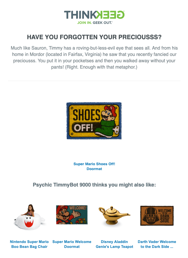
A good abandoned cart email from ThinkGeek.
Abandoned Cart Email Best Practices
Creating effective cart recovery emails involves several best practices to maximize recovery rates and boost revenue. Here are some key strategies:
1. Timing is Key
To maximize the effectiveness of abandoned cart emails, timing is essential. Sending the first email within the first hour of cart abandonment can significantly increase the chances of recovering the sale. Shoppers are more likely to remember their recent browsing activity and feel a sense of urgency. Follow-up emails sent after 24 hours and again at 48 hours if the purchase hasn’t been completed can help maintain engagement and keep the abandoned items top of mind. This strategic timing can lead to higher recovery rates and increased revenue.
2. Personalization Enhances Engagement
Personalizing abandoned cart emails can dramatically improve their effectiveness. Using the shopper’s name, showcasing the specific items they left behind, and suggesting related products can create a more personalized shopping experience. Consumers are more likely to respond to messages that feel tailored to their interests. Incorporating dynamic content such as personalized recommendations or reviews can also make the email more engaging and persuasive, leading to higher conversion rates.
3. Clear and Compelling Call to Action
A clear and compelling call to action (CTA) is vital in driving shoppers back to their carts. The CTA button should be prominently displayed and easy to find, with action-oriented language such as “Complete Your Purchase” or “Return to Your Cart”. The design should be mobile-friendly to ensure it’s easy to click on any device. Additionally, including multiple CTAs throughout the email can provide several opportunities for the shopper to return to their cart and complete the purchase.
4. Offer Incentives
Including incentives such as discount codes, free shipping offers, or limited-time deals can be highly effective in encouraging shoppers to complete their purchases. These incentives can create a sense of urgency and provide additional motivation for returning to the checkout page. However, it’s important to balance the use of incentives to ensure they remain compelling without significantly impacting profit margins.
5. Visual Appeal and Branding
The visual appeal of your abandoned cart emails can significantly influence their success. Using high-quality images of abandoned products, consistent branding, and a clean layout can make the email more attractive and professional. The design should reflect your brand’s identity and be visually engaging to capture the shopper’s attention. Additionally, ensure that the email is optimized for mobile devices, as a significant portion of shoppers will view the email on their phones or tablets.
6. Incorporate Social Proof or UGC Reviews
Incorporating social proof or UGC Reviews in abandoned cart emails can significantly enhance their effectiveness. Through display reviews or testimonials from other customers who have purchased the same products can build brand trust and credibility, encouraging hesitant shoppers to complete their purchases. Highlighting positive feedback can reassure customers of the product’s quality and the satisfaction of other buyers, making them more likely to convert.
To efficiently add reviews to your emails, consider using reliable tools such as Trustify Reviews App. It seamlessly integrates genuine customer feedback into your campaigns, enhancing their effectiveness and increasing your recovery rates.
7. Test and Optimize
Continuous testing and optimization are key to improving the performance of abandoned cart emails. A/B testing different subject lines, email designs, CTAs, and sending times can provide valuable insights into what resonates best with your audience. Analyzing metrics such as open rates, click-through rates, and conversion rates can help identify areas for improvement. By regularly testing and refining your email strategy, you can enhance its effectiveness and drive more conversions.
9 Excellent Abandoned Cart Email Examples
Here are 9 excellent abandoned cart email examples that can inspire your campaign:
1. Amazon
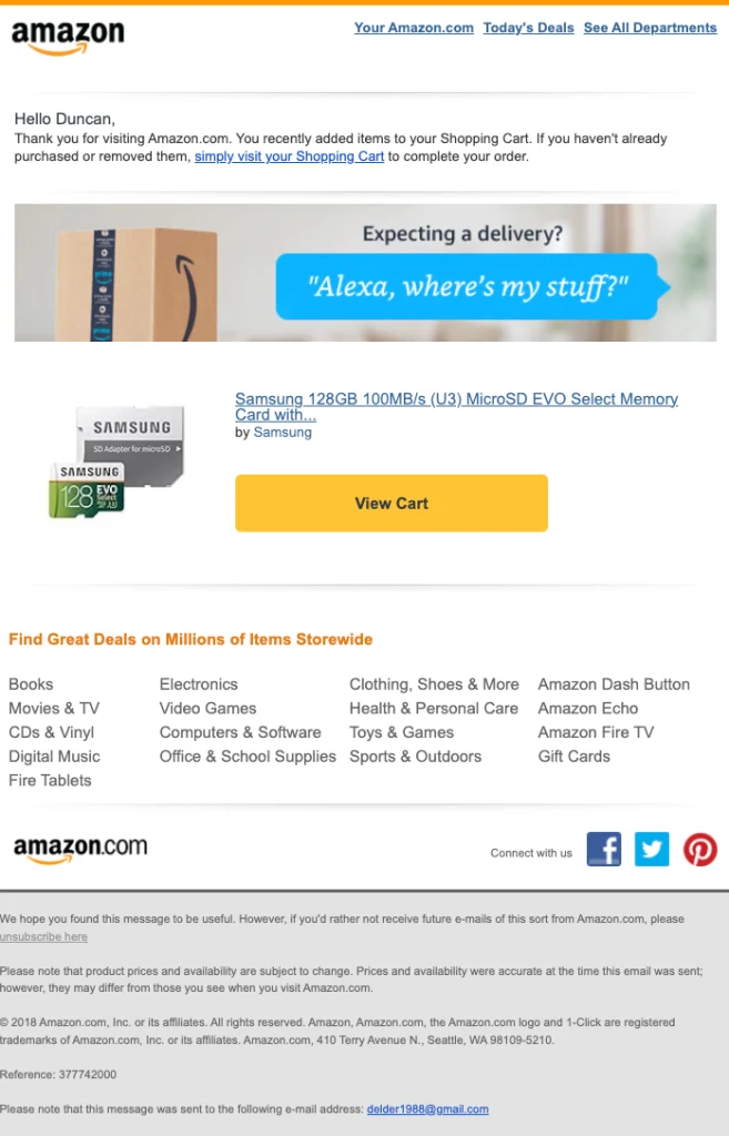
Feature: Personalized product reminders
Amazon’s abandoned cart emails prominently display the exact items left in the cart with clear images, names, prices, and stock status. They often include personalized recommendations based on browsing history to entice customers to return and complete their purchases.
Efficiency: The clear visualization of abandoned items reminds customers of their intended purchase, while personalized recommendations can reignite interest by suggesting related products they might find appealing. This personalization increases the likelihood of converting the cart into a purchase.
2. Casper
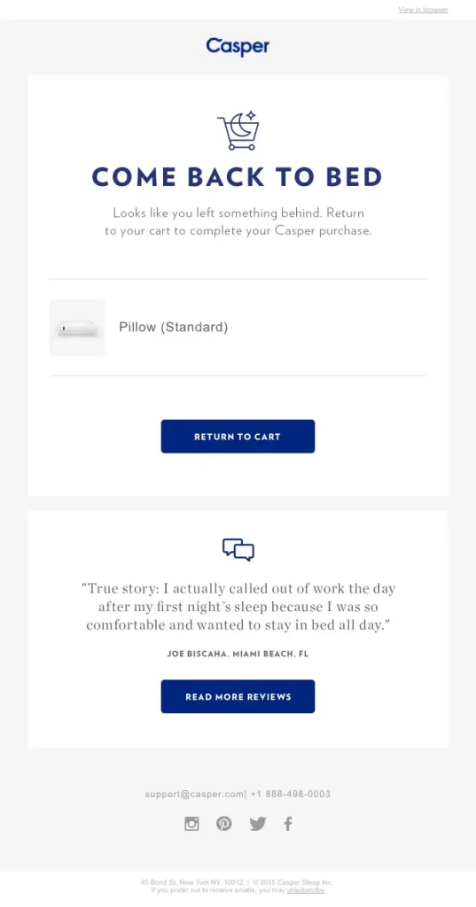
Feature: Friendly and Humorous reminder
Casper uses a light-hearted tone in their emails, with subject lines like “Come back to bed ?” They include images of the abandoned items and a direct link to the cart, making the process simple and engaging.
Efficiency: The friendly and humorous tone makes the email feel less like a sales pitch and more like a nudge from a friend. This approach lowers the customer’s resistance to marketing messages, making them more likely to complete their purchase.
3. FootCardigan
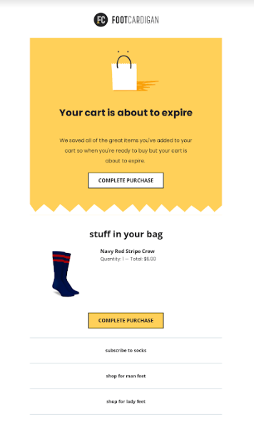
Feature: Sense of urgency
FootCardigan highlights the urgency with phrases like “Your Cart is about to expire” and includes alerts about the limited stock. Their emails feature high-quality images of the products left in the cart, along with a clear call-to-action button.
Efficiency: Creating a sense of urgency taps into the fear of missing out (FOMO). When customers believe that the items they are interested in might soon be unavailable, they are more likely to act quickly to secure their purchase.
4. Warby Parker
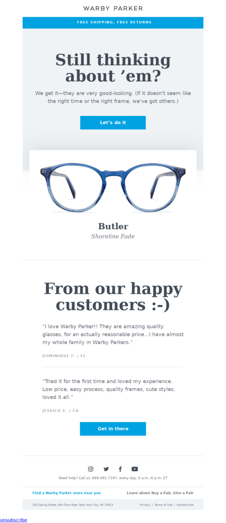
Feature: Customer testimonials
Warby Parker includes glowing customer reviews in their emails to build trust and encourage purchases. They also showcase images of the abandoned items and a quick link back to the cart, making it easy for customers to complete their orders.
Efficiency: Testimonials from satisfied customers build trust and credibility, reducing any hesitation about the purchase. Seeing positive reviews reassures customers that they are making a good decision, thus increasing conversion rates.
5. Target
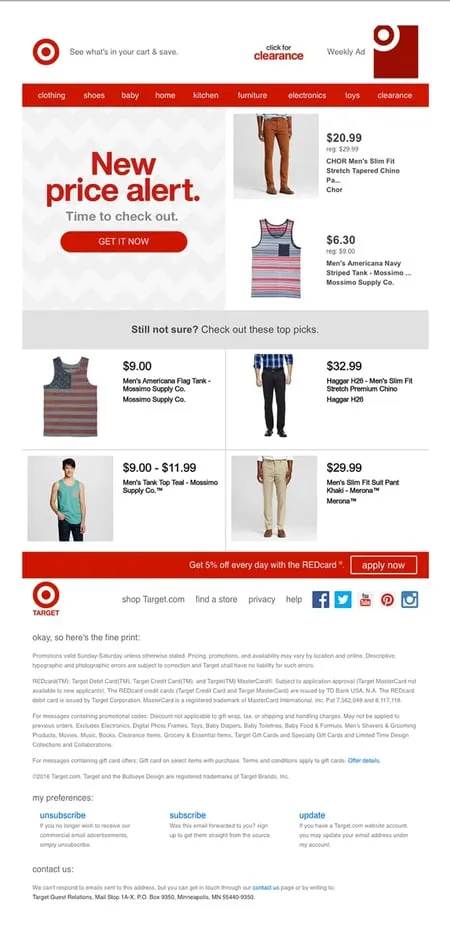
Feature: Personalized discounts
Target often provides a unique discount code in their abandoned cart emails, incentivizing customers to complete their purchases. The email highlights the savings and features images of the items left behind.
Efficiency: Personalized discounts provide a direct financial incentive to complete the purchase. Highlighting the savings makes the offer more attractive, turning a hesitant shopper into a paying customer.
6. Harry’s
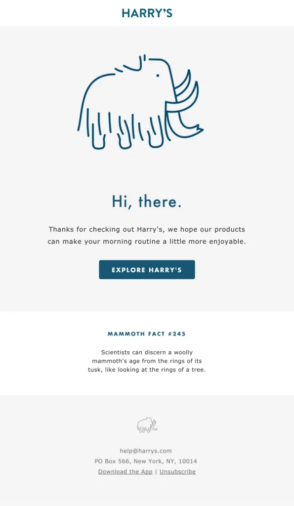
Feature: Minimalistic design
Harry’s uses a clean and simple design, focusing on the abandoned product with a strong call to action. This uncluttered approach keeps the customer’s attention on completing the purchase.
Efficiency: A minimalistic design reduces distractions and keeps the focus on the main goal – completing the purchase. It ensures that the call to action is clear and prominent, making it easy for customers to take the next step.
7. Whiskey Loot
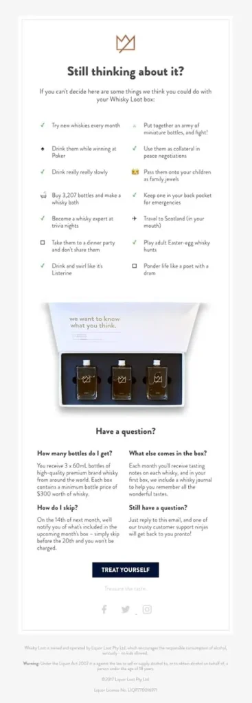
Feature: Product benefits
Whiskey Loot’s emails emphasize the unique features and benefits of the abandoned product, often with detailed descriptions and high-quality images. They reinforce the value proposition to encourage customers to complete their purchase.
Efficiency: Highlighting product benefits and unique features reinforces the value proposition, reminding customers why they were interested in the product in the first place. This can be the nudge they need to proceed with the purchase.
8. Reebok
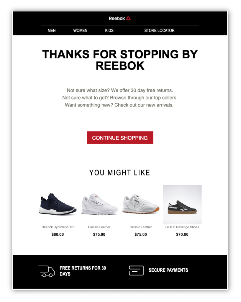
Feature: Limited-time offers
Reebok’s emails often include time-sensitive discount codes or promotions to create urgency. They highlight potential savings and provide a clear call to action to return to the cart.
Efficiency: Time-sensitive offers create a sense of urgency, encouraging customers to act quickly to take advantage of the promotion. This tactic leverages the fear of missing out on a good deal, prompting faster customer decision-making.
9. Moo
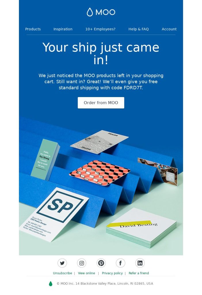
Feature: Visual appeal
Moo’s emails are visually stunning, featuring vibrant images and a clean layout. They include a direct link back to the cart and emphasize the quality and design of the abandoned items.
Efficiency: A visually appealing email grabs attention and keeps the customer engaged. High-quality images and a clean layout enhance the perceived value of the products, making the customer more likely to complete their purchase.
A/B testing improves the performance of abandoned cart emails
A/B testing allows you to experiment with different elements of your abandoned cart emails to determine what works best. By testing variations of subject lines, email copy, images, CTAs, and incentives, you can identify which combinations yield the highest open rates, click-through rates, and conversion rates. This data-driven approach helps refine your email strategy, ensuring that each component is optimized for maximum effectiveness. It’s important to test one variable at a time to accurately measure its impact on performance.
FAQs about Abandoned Cart Email
1. What metrics should be tracked to measure the success of abandoned cart emails?
To measure the success of abandoned cart emails, key metrics to track include the open rate, which indicates how many recipients opened the email; the click-through rate (CTR), showing the percentage of recipients who clicked on a link within the email; and the conversion rate, which measures how many recipients completed their purchase after interacting with the email. Additional metrics like the bounce rate, which shows undelivered emails, and the revenue recovered from the emails provide deeper insights into their effectiveness. Analyzing these metrics helps refine the strategy and improve overall performance.
2. What are some common mistakes to avoid in abandoned cart email campaigns?
Common mistakes to avoid include overly aggressive messaging, lack of personalization, and cluttered design. Being too pushy or sending too many reminders can annoy customers and lead to unsubscribes. Failing to personalize the email makes it feel generic and less engaging, reducing its effectiveness. Additionally, a cluttered design with too much information or too many calls-to-action can overwhelm the customer and detract from the primary goal of completing the purchase. Keeping the email clear, focused, and customer-centric is key to success.
3. How many cart abandonment emails should be sent, and when?
It is generally effective to send a series of 2-3 emails. The first email should be sent within an hour of the cart being abandoned, as this is when the customer’s interest is still fresh. The second email can be sent within 24 hours, reinforcing the reminder and possibly including an incentive. A final email can be sent within 48-72 hours, creating a sense of urgency with messages about limited stock or expiring offers. This sequence balances persistence with respect for the customer’s inbox, increasing the chances of recovering the sale without being overly intrusive.
WRAP UP
Cart abandoned emails are a powerful tool for recovering lost sales and enhancing customer engagement. By sending timely, personalized reminders and incorporating elements like urgency, incentives, and clear calls-to-action, businesses can effectively prompt customers to complete their purchases. Tracking key metrics such as open rates, click-through rates, and conversion rates is essential for measuring success and optimizing campaigns.
When executed thoughtfully, cart abandonment emails not only boost conversions but also contribute to building customer loyalty and long-term retention.