A Thank You landing page typically appears after a visitor fills out a contact form on the landing page or website. It even has the potential to drive high user conversions and can also increase sales through additional CTAs. In this article, we will explore the benefits of a Thank You page, how to use it effectively, and the elements that should and should not be included on the page.
What is a Thank You Page?
A thank you page is the destination where your customers and leads are directed right after they complete a form or make a purchase on your website. While not mandatory, it significantly contributes to creating a positive impression with customers when shopping on the business’s website.
This page also creates an opportunity to convert potential customers into buyers and can also turn existing buyers into loyal customers.
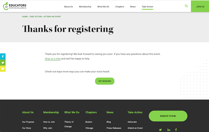
Benefits of a Thank You Page
You will never have an easier or more natural opportunity to surprise your customers with something that delights them and meets their exact needs. How do you know what your customers want? They tell you precisely what they want by following the call to action on your page.
After someone follows the CTA on a landing page, guide them to the next step. Show your customers that you are ready to provide value time and time again.
For example, if a customer makes a purchase on your website, use the Thank You page for the website as an opportunity to add value through additional resources or content. This will build your brand trust and delight your customers.
Additionally, you can use this page as an opportunity to provide potential customers with the next steps. If a lead has downloaded an eBook, the page can list alternative social media resources you would like to offer.
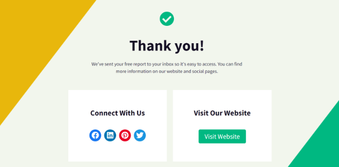
Dos and Don’ts of a Thank You Landing Page
A Thank You page is used not only to express gratitude to customers but also to enhance conversion value with a CTA (call-to-action) button placed on the page. What should it include to optimize its effectiveness? Let’s answer this through the following information.
What Should be Included?
Thanking Customers for a Specific Action
When customers perform any action on your website, such as downloading an ebook, purchasing a product, or registering for a webinar, acknowledge and thank them for that action.
Keep It Short and Sweet
When it comes to a Thank You page, keep it as concise and simple as possible to avoid overwhelming customers with too much information.
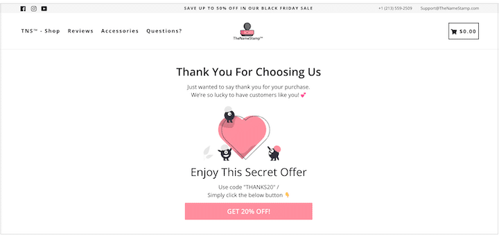
Enhance Your Brand
To ensure your brand stays top of mind, your branding must be consistent across all customer touchpoints. The same applies to your Thank You page—use it to reinforce your brand image in the customer’s subconscious.
Strong Call to Action
Besides expressing gratitude, a Thank You page often guides users towards the next steps. This can increase customer interaction and conversion potential on your website.
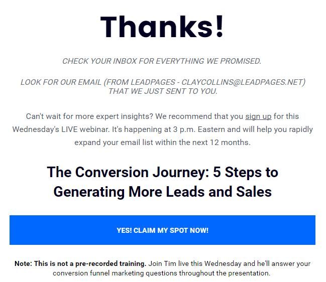
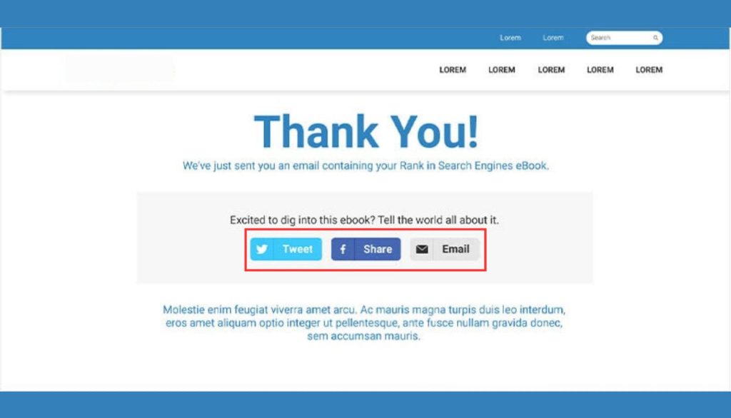
Social Media Sharing
A Thank You page can encourage potential customers to share on social media by including social sharing icons to direct them.
What Shouldn’t be Included?
Too Much Content on the Thank You Page
Do not use more than 5 lines in a paragraph on the Thank You landing page. Unless absolutely necessary, create a page with plenty of open space for visitors. They may feel overwhelmed with lengthy and winding content. Additionally, too much content can cause your CTA to go unnoticed. Therefore, keep it simple and use ample white space.
Don’t Promise Something You Can’t Deliver
If you are not certain about your promise, do not commit to it. Instead, tell them you will get back to them shortly. Conveying accurate information to customers is always better than making false promises. It will prevent you from failing at a later stage.
Basic Structure of a Thank You Landing Page
There are many ways to design a Thank You page. However, following an established template is always helpful. Below are some basic elements that your Thank You page should include:
- Thank You Message.
- Details about the conversion (such as the number of eBook downloads, seat details in a movie theater…).
- Contact instructions if any action is required. For example, specify any guidelines that users must follow.
- Brand contact details.
- What visitors can expect next from you. For instance, a phone call within one business day, a confirmation email, SMS…
- Instructions on what visitors should do next. This will help achieve the goals of your Thank You page.
Thank You Page Examples
1. Simple Confirmation Thank You Page
A straightforward page that simply thanks the user and confirms their action, such as “Thank you for your purchase!” or “Your subscription is confirmed.”
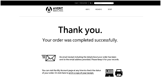
Upon completing an order, the page displays a clear message: “Thank you. Your order was completed successfully.” It also informs the customer that an email receipt, including order details, has been sent to their provided email address and advises them to keep it for their records.
Additionally, it provides further instructions, allowing the customer to visit the “My Account” page to check the order status or to print a copy of the receipt. The design is minimalist and focused, ensuring clarity and ease of understanding for the customer.
2. Event or Webinar Thank You Page
Confirms registration for an event or webinar and provides details about the event, such as date, time, and how to join.
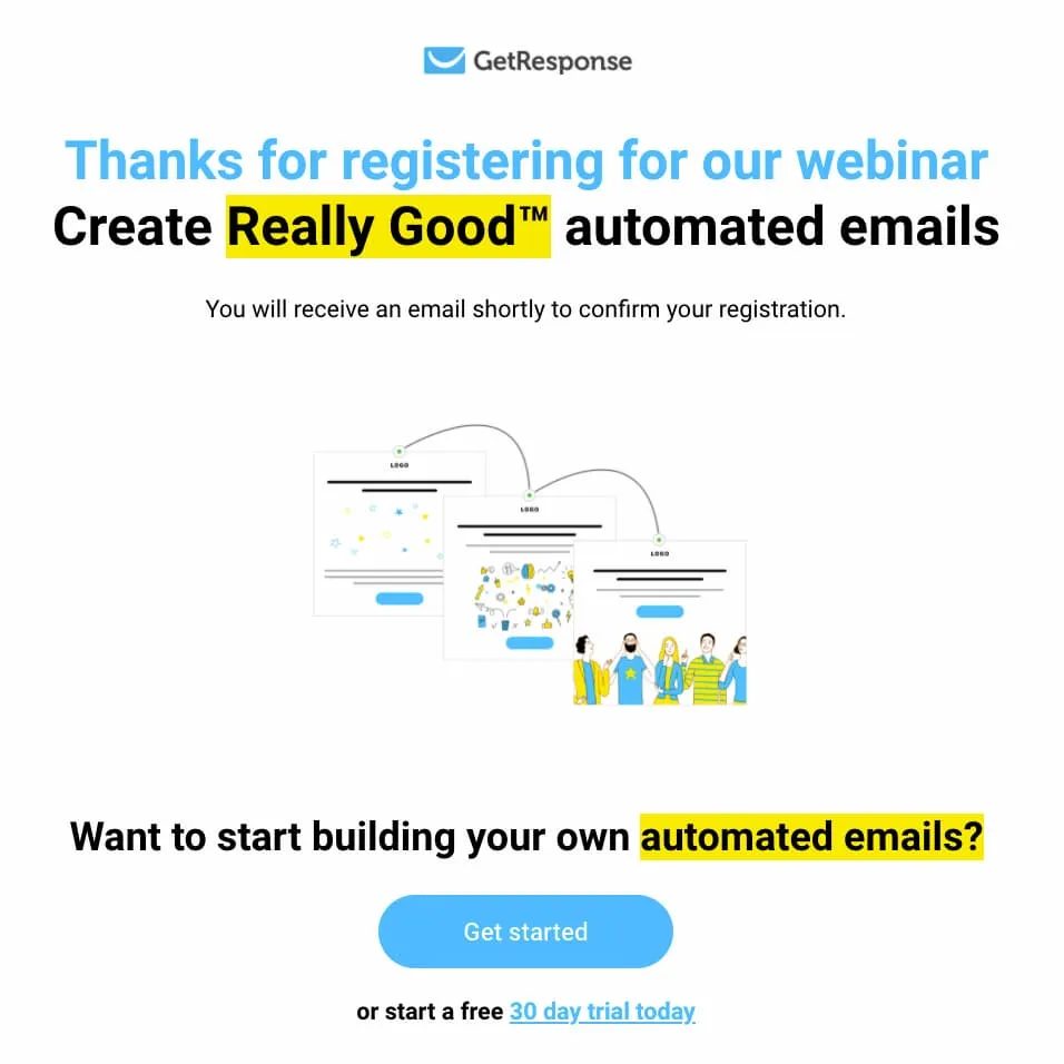
Here is an example of a Thank You page that GetResponse uses for their webinars. Although this page may look simple, it is highly effective. It confirms that the customer has successfully registered for the webinar and informs them that they will receive a confirmation email shortly. Additionally, it guides them to either log in or create a free account on GetResponse.
3. Upsell or Cross-sell Thank You Page
After thank the user, this type of page suggests additional products or services they might be interested in, encouraging further purchases.
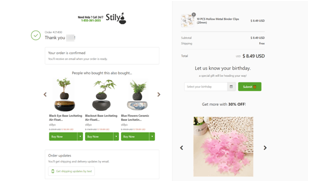
This example demonstrates an Upsell or Cross-sell Thank You Page by Stily. The page begins by confirming the order with a message: “Thank you. Your order is confirmed. You’ll receive an email when your order is ready.” To encourage further purchases, it displays a section titled “People who bought this also bought…” featuring related products with “Buy Now” buttons.
4. Next Steps Thank You Page
This page provides guidance on what the user should do next, such as checking their email for a confirmation message, downloading an eBook, or accessing a webinar link.
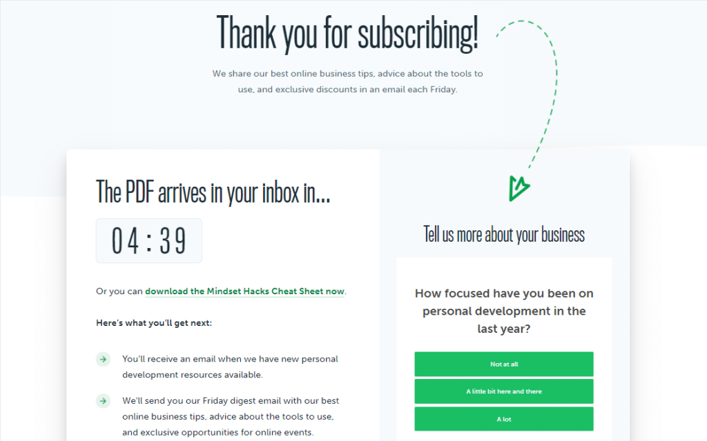
The page outlines what the subscriber will receive next, such as emails with personal development resources and a weekly business tips digest. Additionally, it prompts users to provide more information about their business to personalize future content, ensuring they know what to expect and encouraging further engagement.
5. Survey or Feedback Thank You Page
After expressing gratitude, this page invites users to provide feedback or complete a survey about their experience.
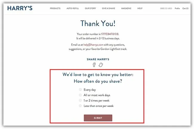
A notable feature is the survey section at the bottom, which aims to gather customer insights. The survey asks, “How often do you shave?” with multiple choice options such as “Every day”, “All or most work days”, “1 or 2 times per week”, and “Less than once per week”.
This not only engages customers by inviting them to share their habits but also provides Harry’s with valuable data to better understand their customers’ needs and preferences.
6. Social Sharing Thank You Page
Encourages users to share their recent action on social media by including social sharing buttons and a message like “Share your experience with your friends!”
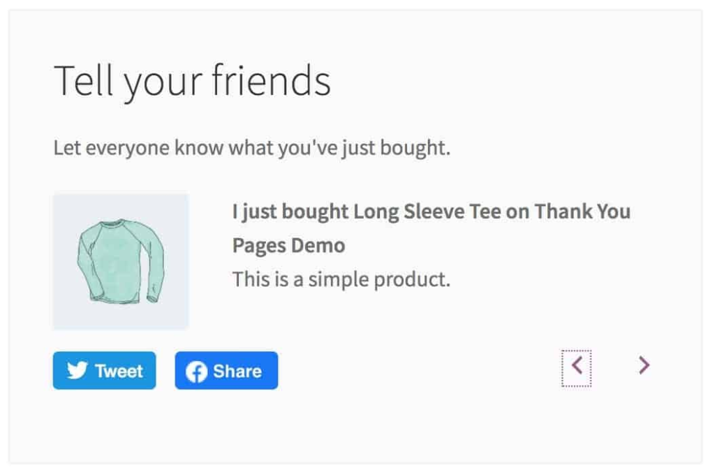
It focuses on encouraging users to share their recent purchase on social media. The page includes a message prompting the user to “Tell your friends” and “Let everyone know what you’ve just bought.” It provides social sharing buttons for Twitter and Facebook, allowing the user to easily share their purchase of a “Long Sleeve Tee” with a simple message.
This strategy helps increase brand visibility and leverages customer satisfaction to attract more potential buyers through social proof.
7. Resource Thank You Page
Offers additional resources, such as blog posts, guides, or related content, to provide more value to the user after they complete their action.
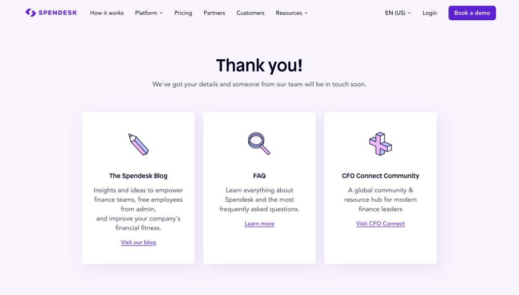
Spendesk uses this resource Thank You Page to confirm user details and thank them, assuring that a team member will be in touch shortly. The page then offers additional resources to provide more value, including links to the Spendesk Blog for insights and ideas, an FAQ section for common questions, and the CFO Connect Community, a global resource hub for finance leaders.
8. Membership or Account Creation Thank You Page
If the user has signed up for an account or membership, this page provides details about their new account and how to access its benefits.
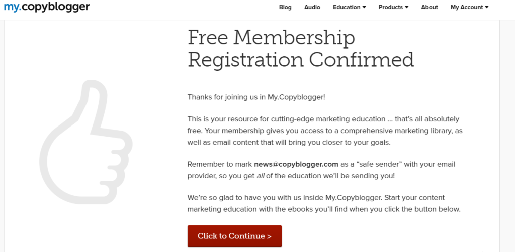
This image shows a Membership Confirmation Thank You Page from My.Copyblogger. It confirms the user’s free membership and provides details about the new account benefits. The page welcomes the user, explaining that they now have access to a comprehensive marketing library and valuable email content. It also reminds them to mark the sender’s email as safe to ensure they receive all educational materials. Finally, it invites the user to start their content marketing education by clicking a button to access ebooks, helping them understand and use their membership benefits.
9. Referral Thank You Page
Encourages users to refer friends or family members to your service, often including a referral link or code.
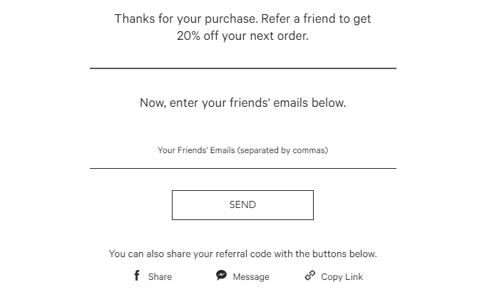
Following the purchase confirmation, it offers a 20% discount on the next order for each referral. Users are prompted to enter their friends’ email addresses or use social sharing options like Facebook, messaging, or copying a referral link. The straightforward and clear layout facilitates easy participation in the referral program, enhancing customer engagement and boosting potential sales through word-of-mouth referrals.
10. Downloadable Content Thank You Page
Provides access to downloadable content, such as an eBook, whitepaper, or template, immediately after the user completes a form or purchase.
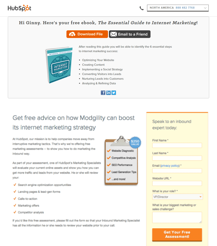
After completing a form, users can immediately download the eBook, “The Essential Guide to Internet Marketing.” The page features a “Download File” button and an option to “Email to a Friend,” covering topics like website optimization, content creation, social strategies, lead conversion, customer nurturing, and data analysis.
Wrap up
Thank you pages are effective and applicable to all businesses. Use them for any user action, such as downloads, registrations, quote requests, signups, and contact forms—the possibilities are endless.
They add significant value to your business and require minimal time to implement. They can also enhance sales through cross-selling, upselling, referrals, and promoting discounts.
